Luckee
An AI analyst that does Amazon research before your competitors even know where to look.
- Role
- Solo Designer (Freelance)
- Timeline
- Apr 2026 · ~2 weeks · Figma Make
- Scope
- Brand · AI Chat UI · Template System · Report Generator
- Year
- 2026
Case at a glance
What it is, what was wrong, and what shipped — before the screenshots.
What this is
The project
Luckee is an AI SaaS tool for Amazon sellers — a chat-driven analyst that covers blue-ocean niche discovery, review analysis, ad diagnostics, competitor tracking, trend forecasting, and profit calculation. I designed the full product end-to-end as a freelance engagement, delivering in two weeks via Figma Make.
What was broken
The problem
Cross-border sellers make decisions across fragmented tools — keyword spreadsheets, ad dashboards, review scrapers, pricing calculators. The research step alone burns hours before anyone asks the real question: "should I enter this market?"
What I did
The action
I designed one conversational surface that handles six research workflows through prompt templates, generates structured downloadable reports, and keeps a persistent sidebar of past sessions — all in a cohesive editorial palette (sage + cream + serif) that positions Luckee as a premium tool, not a chatbot wrapper.
Outcomes & evidence
0→1
Full product design delivered in ~2 weeks
Freelance engagement; product now in staging.
6
AI template workflows designed (research → report)
Blue Ocean · Review · Ad · Competitor · Trend · Profit
Figma Make
End-to-end delivery tool — design + interaction in one
No handoff gap; interactive prototype = design spec.
Narrative — 01
Background
Luckee is an AI-powered research platform for Amazon sellers. The client wanted a single product surface where sellers can ask natural-language questions — "find me blue-ocean niches with monthly volume above 5K and growth above 15%" — and get back structured, actionable reports instead of raw data dumps.
I took this on as a freelance project and owned the entire design scope: brand direction, the conversational UI, the template system, the report layout, and the platform shell (sidebar navigation, settings, account). All delivered via Figma Make in roughly two weeks.
Narrative — 02
Problem
The cross-border seller's research stack is fragmented and manual:
1. 【Six tools for six jobs.】 Keyword research, review scraping, ad analytics, competitor monitoring, trend tracking, profit calculation — each lives in a separate SaaS tab with its own learning curve and pricing. Sellers context-switch constantly.
2. 【AI is invisible or unreliable.】 Some tools bolted on a chatbot, but the output was unstructured text — not the tables, rankings, and downloadable reports sellers actually need to make procurement decisions.
3. 【No memory, no continuity.】 Every research session starts from zero. There's no "pick up where I left off" — yesterday's blue-ocean scan can't feed today's competitor monitor without manual re-entry.
Evidence
Screens, flows, and brand artifacts — the visual proof behind the narrative above.
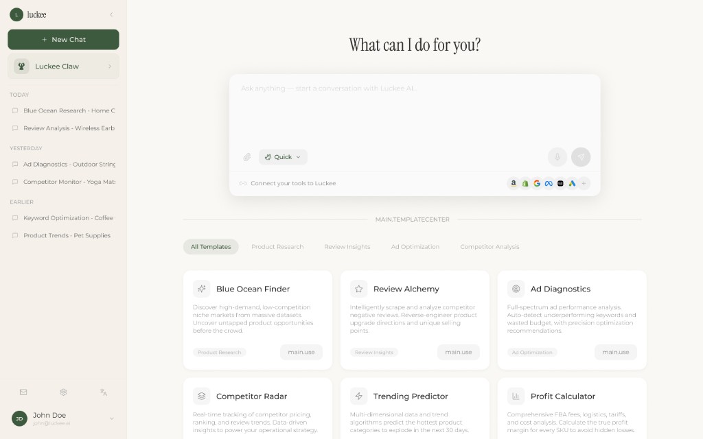
01 — Home & templates
One input, six workflows
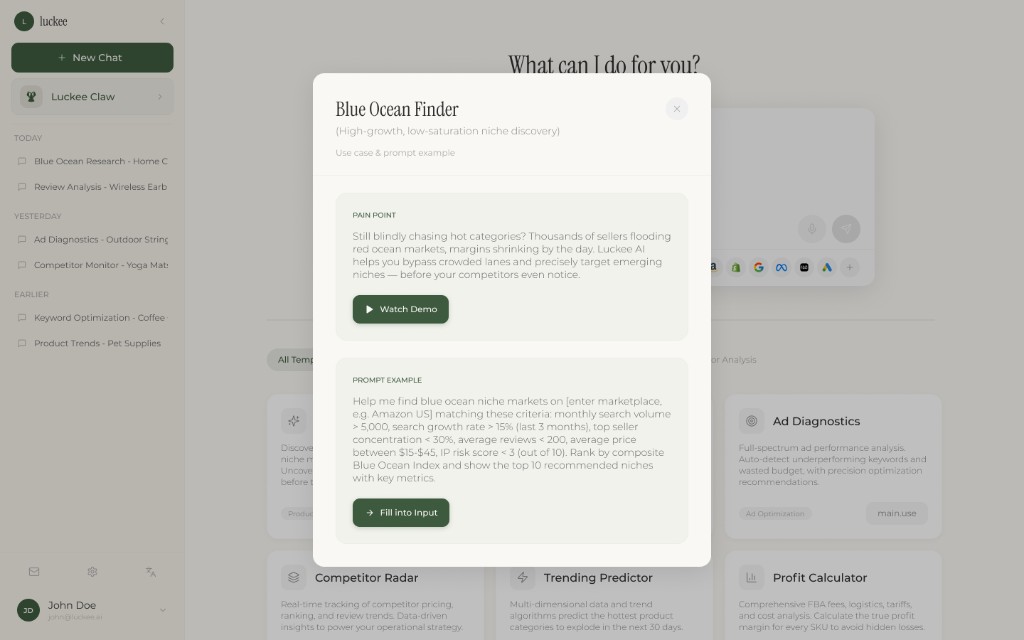
The home screen gives sellers a single chat input and a grid of pre-built prompt templates — Blue Ocean Finder, Review Alchemy, Ad Diagnostics, Competitor Radar, Trending Predictor, Profit Calculator. Each template opens a detail card with a pain-point framing, a demo video link, and a one-click 'Fill into Input' action.
02 — Chat & execution
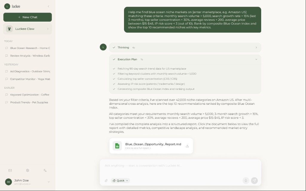
From question to structured answer
The seller sends a parameterized prompt; Luckee shows a Thinking step, then an Execution Plan with real-time progress (fetching trends → filtering keywords → calculating CRS → assessing IP risk → generating index). The final response includes a narrative summary and a downloadable report document.
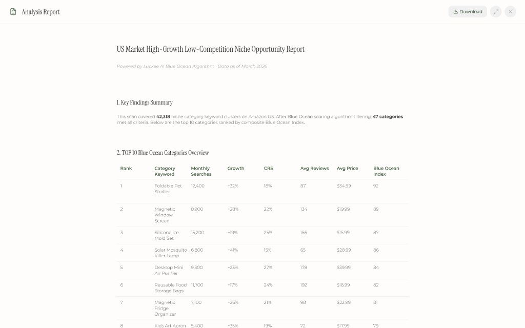
03 — Report system
Data that reads like a brief, not a spreadsheet
The generated report opens in a full-screen reader view: Key Findings Summary at the top, then a ranked table (Rank · Category Keyword · Monthly Searches · Growth · CRS · Avg Reviews · Avg Price · Blue Ocean Index). Download as a single document. The layout treats data as editorial content — serif headings, generous white space, no toolbar noise.
Action
Key design moves
- 01
Templates as onboarding, not shortcuts
Most AI tools bury prompt templates in a sidebar or a "try this" tooltip. I gave them the entire home screen. Each card frames a pain point ("Still blindly chasing hot categories?"), shows a demo video, and offers a fill-to-input action. Templates do three jobs at once: they teach the seller what Luckee can do, they reduce blank-page anxiety, and they standardise the prompt structure so the report output stays consistent.
- 02
Show the machine thinking, not just the answer
When Luckee scans 42,000 keyword clusters, the user needs to trust the process, not just the result. I designed a two-stage execution view: a collapsed "Thinking" indicator, then an "Execution Plan" with real-time checkmarks — fetching data, filtering, calculating concentration, assessing IP risk, generating the index. This transparency pattern converts wait time into confidence: the user watches their answer being built step by step.
- 03
Reports as editorial objects, not data exports
The conventional approach is "generate a CSV and let the seller sort it." I went the opposite way: a full-screen reader view with a Key Findings Summary at the top, followed by a ranked table with a composite Blue Ocean Index. Serif headings, generous white space, no toolbar noise. The report reads like a research brief you'd hand to a procurement lead — not a spreadsheet you'd dread opening. This elevates the perceived value of every interaction.
Results
What changed — and how design earned it.
01
User & business outcome
Luckee collapses six fragmented seller tools into one conversational surface. A research workflow that used to require bouncing between tabs, exporting CSVs, and manually cross-referencing — now starts with a question and ends with a downloadable brief.
02
How design delivered
A template-driven home that doubles as onboarding, a transparent execution view that builds trust during computation, and a report layout that treats data as editorial content. Together they position Luckee as a premium intelligence tool — not another chatbot with an Amazon API.
03
Leverage for the team
- 01
Delivered the full design system (brand palette, chat UI, template cards, report layout, platform shell) in two weeks — ready for front-end implementation.
- 02
Established a reusable template-card pattern that scales to any number of future AI workflows without redesigning the shell.
- 03
Set visual parity with the client's aspiration brands (premium SaaS tone) from day one, avoiding a 'chatbot prototype' first impression.
Narrative — Reflection
What this project leaves me with.
The most useful thing about this project was the constraint. Two weeks, Figma Make only, one designer. That forced me to design primitives — template card, execution step, report block — before ever thinking about "features." Once those three bricks existed, every new workflow (Review Alchemy, Competitor Radar, etc.) assembled itself.
The other thing I'd note: designing an AI tool for experienced sellers is different from designing for students or analysts. These users don't need onboarding copy — they need the interface to prove, in the first 10 seconds, that it already understands their vocabulary ("CRS", "Blue Ocean Index", "IP risk score"). The templates do that job: they speak the seller's language before the seller types a word.
If I had more time, I'd push the report system further — interactive charts, comparison mode across multiple scans, and an "export to Notion" integration. The current version is a clean read; the next version should be a working document.